How to Choose Yarn Colors for Crochet: Color Theory, Palettes & Contrast Tips
You find the perfect crochet pattern. The stitches are beautiful. You already know which yarn you want to use. Then you reach the yarn shelf and suddenly have ten different shades in front of you. Cream or white? Sage or olive? Dusty rose or terracotta? And somehow, colors that looked gorgeous on their own don't look nearly as good when you put them together. Choosing yarn colors for crochet can be surprisingly difficult. But you don't need to be an artist or memorize complicated color theory to create a beautiful crochet color palette. A few simple tricks can make a huge difference. You can use the color wheel to find combinations that naturally work together, use contrast to make patterns easier to see, and use a few simple rules to stop your project from looking too busy. Whether you're choosing colors for a crochet blanket, granny squares, a sweater, scarf, bag, or another accessory, this guide will help you put together a yarn color palette that looks intentional and balanced.
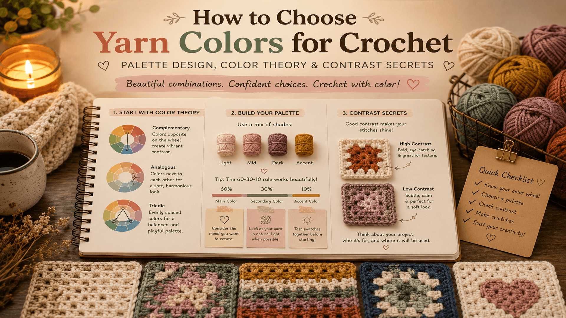
How to Choose Yarn Colors for Crochet
Before choosing individual skeins, think about how you want the finished project to feel.
Do you want it to be:
Soft and calming?
Warm and cozy?
Bright and playful?
Modern and neutral?
Vintage-inspired?
Earthy and natural?
Bold and colorful?
This sounds simple, but it gives you somewhere to start.
A soft crochet blanket might work beautifully with oatmeal, cream, dusty blue, and sage.
A bright summer bag could use coral, turquoise, yellow, and white.
A modern crochet throw might need only charcoal, cream, and one muted accent color.
You don't need ten colors to make a project interesting.
Sometimes three well-chosen colors look better than eight colors fighting for attention.
Start With Inspiration
One of the easiest ways to choose a crochet color palette is to start with something you already love.
It could be:
A photograph
A flower
A painting
A favorite outfit
Wallpaper
A room in your home
A sunset
A landscape
An old quilt
Look at the image and choose three to five colors that stand out.
Imagine a photograph of a beach at sunset.
You might pull out:
Sand + cream + dusty peach + muted coral + deep blue.
Now you have a starting palette without having to invent one from nothing.
This is especially useful when choosing colors for a crochet blanket because blankets contain so much surface area.
A color that looks lovely in one granny square can feel completely different when repeated across an entire blanket.
Use the Color Wheel Without Overthinking It
You don't have to become a color theory expert.
The color wheel is simply a useful way to see which colors have a natural relationship with one another.
Here are four easy crochet color schemes to try.
Monochromatic Crochet Color Palettes
A monochromatic palette uses different versions of the same color.
Think:
Navy + medium blue + dusty blue + pale blue.
Or:
Deep green + sage + soft mint + olive.
This is one of the easiest choices if you want a calm, sophisticated crochet project.
It can also work beautifully with textured crochet because the stitch pattern remains the main feature instead of competing with lots of color changes.
Analogous Color Combinations
Analogous colors sit next to each other on the color wheel.
For example:
Blue + blue-green + green.
Or:
Yellow + golden yellow + orange.
These combinations tend to feel natural and easy on the eye.
They're particularly lovely for crochet blankets inspired by nature.
Try:
Sage + moss + muted mustard + warm cream.
The cream gives the stronger colors somewhere to rest.
Complementary Colors
Complementary colors sit opposite each other on the color wheel.
Examples include:
Blue + orange
Purple + yellow
Green + red
These combinations create strong contrast and can work beautifully for bold crochet blankets, granny squares, and colorful accessories.
But you don't have to use extremely bright versions of both colors.
Try dusty blue with muted terracotta instead of bright blue with bright orange.
The result can feel much softer and more sophisticated.
Triadic Color Palettes
A triadic palette uses three colors spaced around the color wheel.
For example:
Mustard + dusty pink + blue.
Or:
Coral + yellow + teal.
Triadic palettes can be colorful without looking completely chaotic, especially when one color is allowed to dominate and the other two are used more sparingly.
How Many Colors Should You Use in Crochet?
There isn't one correct number.
But if you're unsure, three to five colors is a good place to start.
2 colors: Clean and simple
3 colors: Balanced and easy to control
4 colors: More variety without becoming overwhelming
5 colors: Great for colorful blankets and granny squares
6 or more colors: Can work beautifully, but you'll need to pay more attention to contrast and repetition
A large crochet blanket doesn't automatically need lots of colors.
In fact, limiting the palette can make a large project look more cohesive.
If you're completely stuck, choose one main color, one supporting color, one neutral, and one accent.
That's already enough to create a strong crochet color palette.
Try the 60-30-10 Rule
Here's a simple trick borrowed from interior design that works surprisingly well for crochet.
Think of your palette as:
60% dominant color
30% secondary color
10% accent color
The dominant color might be the background of your crochet blanket.
The secondary color can appear in stripes, motifs, or larger sections.
The accent is the color you use sparingly to make certain details stand out.
For example:
60% cream.
30% sage green.
10% dusty pink.
The pink becomes more noticeable because you're not using it everywhere.
You don't need to measure your yarn down to the gram. Think of the 60-30-10 rule as a visual guide rather than a strict mathematical formula.
And don't be afraid to break it.
Crochet is creative work, not interior-design homework.
The Secret to Good Crochet Color Combinations: Value
Here's where many yarn color choices go wrong.
You can choose colors that are completely different in hue but still have very little contrast.
Imagine putting medium blue beside medium purple.
They're different colors.
But if their lightness is almost identical, they can visually melt together.
This is called value.
Value simply means how light or dark a color is.
For crochet colorwork, value can sometimes matter more than the actual color.
This becomes especially important when you're making:
Crochet blankets with repeating motifs
Tapestry crochet
Mosaic crochet
Graphgans
Granny squares
Striped patterns
Geometric colorwork
If the colors don't separate enough, the design can become difficult to see.
Try the Black-and-White Yarn Test
You can check value contrast using nothing more than your phone.
Place your yarn skeins beside each other.
Take a photo.
Then change the photo to black and white.
Look at the yarn again.
Can you clearly see which shades are lighter and darker?
Or have two or more colors turned into almost the same shade of grey?
If two colors become almost identical in the black-and-white photo, they have similar value and may not provide enough contrast for detailed crochet colorwork.
This doesn't mean you can never use them together.
It simply means you should know what will happen.
If you're making a detailed colorwork design, try replacing one of the similar-value shades with something noticeably lighter or darker.
This tiny test can save you from finishing half a blanket and realizing the pattern has disappeared.
Don't Forget Neutral Yarn Colors
Neutral yarn colors are incredibly useful when building a crochet color palette.
Think:
Cream
Ivory
Oatmeal
Beige
Warm taupe
Grey
Charcoal
Soft brown
Off-white
A neutral can act as a bridge between colors that might otherwise compete.
For example:
Mustard + rust + sage.
That already makes a beautiful combination.
Add warm cream, and suddenly the palette has somewhere to breathe.
A neutral doesn't have to be the boring color in your yarn basket.
It can be the color that makes all the other colors work.
Solid Yarn or Variegated Yarn?
This is another important choice.
If your crochet pattern already has lots of texture, a very busy yarn can hide it.
Imagine making a beautiful alpine stitch blanket with highly variegated yarn.
The yarn changes color constantly.
The stitches change direction.
There are shadows everywhere.
The result might still be interesting, but the texture can become difficult to appreciate.
For textured crochet stitches such as:
Alpine stitch
Waffle stitch
Cables
Post stitches
Bobbles
Detailed lace
solid or gently tonal yarns are often easier to work with.
On the other hand, simple stitches can be perfect for showing off variegated yarn.
A basic moss stitch, granny stripe, or simple single crochet fabric gives the changing colors room to become part of the design.
A useful rule is:
Busy stitch + busy yarn = potentially too much.
Simple stitch + interesting yarn = often a great combination.
How to Choose Colors for a Crochet Blanket
Choosing colors for a crochet blanket deserves a little extra thought because the project is large.
Start with your main color.
This might appear in the background, border, or most frequently repeated sections.
Then choose two or three supporting shades.
Finally, add an accent if the palette needs a little energy.
For example:
Soft Cottage Palette
Cream + sage + dusty rose + warm brown.
Modern Neutral Palette
Oatmeal + charcoal + stone grey + ivory.
Coastal Palette
Cream + dusty blue + seafoam + muted navy.
Warm Autumn Palette
Rust + mustard + olive + brown + cream.
Soft Vintage Palette
Dusty pink + faded blue + butter yellow + sage + ivory.
You don't have to copy one of these palettes.
The important thing is noticing how the colors relate to one another.
If you love one color but can't find another color that works with it, try adding a neutral first.
That can make the rest of the palette much easier to build.
Look at Your Yarn in Natural Light
Yarn can look completely different under store lighting.
A shade that looks like a soft cream under warm indoor lights might look noticeably yellow beside a window.
Whenever possible, check your colors in natural daylight.
Lay all the yarn together rather than judging each skein separately.
This matters because you're not really choosing individual colors.
You're choosing how the colors will look next to one another.
A beautiful green can suddenly look too yellow when placed beside mustard.
A grey can appear blue next to cream.
A warm beige can make a pink look cooler.
Color is relational.
That's why putting the skeins together is so important.
Make a Small Crochet Swatch Before Starting
You don't need to crochet an entire blanket to test your yarn colors.
Make a small swatch.
A granny square works especially well if your project uses granny squares.
For stripes, crochet several rows using the colors in the order you plan to use them.
Then look at the swatch from a distance.
This is important.
Up close, almost every yarn color can look beautiful.
Step back a few feet.
Does the palette still work?
Does one color completely take over?
Do two shades disappear into each other?
Does the combination feel too bright?
Does it look completely different from what you imagined?
This is the point where you can change your mind without having wasted dozens of hours.
What If Your Crochet Colors Don't Look Right Together?
Don't immediately assume you chose the wrong colors.
Sometimes the palette simply needs one small adjustment.
Try removing the color that feels out of place.
Then look again.
If it still feels wrong, try adding a neutral.
You can also change the proportion of a color.
A shade that feels overwhelming when used throughout a blanket might look perfect as a small accent.
Another trick is changing the value.
If everything feels too similar, add something noticeably lighter or darker.
And if everything feels loud, add a softer, quieter shade.
You don't always need a completely new palette.
Sometimes one color simply needs to step back.
A Simple Formula for Creating Your Own Crochet Color Palette
If choosing yarn colors still feels overwhelming, use this formula:
1 main color
1 neutral
1 supporting color
1 accent
For example:
Sage + cream + dusty blue + terracotta.
Or:
Terracotta + oatmeal + olive + mustard.
Or:
Navy + ivory + dusty rose + camel.
Once you have those four, decide whether the project really needs another color.
Usually, it doesn't.
Don't Choose Yarn Colors Only From the Skein
This is probably the biggest lesson.
A skein can look gorgeous by itself and still be completely wrong for your project.
The way yarn looks depends on:
The colors beside it
The stitch pattern
The amount of each color used
The lighting
The size of the project
The contrast between shades
Whether the yarn is solid, tonal, speckled, or variegated
That's why a tiny swatch can tell you more than staring at ten skeins on a shelf.
Crochet turns color into fabric.
And fabric behaves differently from a pile of yarn.
Final Crochet Color Palette Tips
Before committing to your yarn, ask yourself:
Do I have a clear dominant color?
Do the colors work together when placed side by side?
Is there enough light and dark contrast?
Am I using too many competing colors?
Will my stitch pattern still be visible?
Does the palette suit the type of project?
Have I looked at the yarn in natural light?
Have I tested the colors in a small swatch?
Would a neutral help connect the palette?
Am I using the accent color sparingly enough?
If the answer is yes to most of these, you're probably on the right track.
And remember: there is no single correct crochet color palette.
Color theory gives you a starting point.
Your taste decides where you go from there.
The best crochet color combinations aren't always the ones that follow every rule. Sometimes a slightly unexpected color is exactly what makes a blanket memorable.
So put the skeins together.
Take a photo.
Try the black-and-white test.
Crochet a little swatch.
Then trust your eye.
Once you start paying attention to value, proportion, and the way colors behave beside one another, choosing yarn colors becomes much less intimidating — and a lot more fun.
Frequently Asked Questions
How many colors should I use in a crochet blanket?
Three to five colors is a good starting point for most crochet blankets. Two colors can create a clean, modern look, while four or five give you more room for colorful motifs and stripes.
What colors go well together for crochet?
Some easy combinations include cream and sage, navy and cream, terracotta and dusty blue, mustard and olive, dusty pink and grey, and rust with warm neutrals.
You can also use a color wheel to create monochromatic, analogous, complementary, or triadic crochet color palettes.
How do I choose colors for a crochet blanket?
Start with one main color, then add a neutral and two or three supporting shades. Look at all the yarn together in natural light and test the palette in a small crochet swatch before starting the full blanket.
How do I know if my crochet colors have enough contrast?
Take a photo of your yarn and change it to black and white. If two colors become almost identical shades of grey, they have similar value and may not provide enough contrast for detailed crochet colorwork.
Should I use variegated yarn with a textured crochet stitch?
Simple or subtle yarn colors usually make complex textured stitches easier to see. Variegated yarn can work beautifully with simple crochet stitches because the changing colors become part of the design.
What is the 60-30-10 rule for crochet colors?
It is a simple way to divide a color palette into approximately 60% dominant color, 30% supporting color, and 10% accent color. It's a guideline rather than a strict rule, but it can help prevent a multi-color crochet project from feeling too busy.
Should I always include a neutral in my crochet palette?
No. But a neutral can be extremely useful. Cream, oatmeal, taupe, grey, or another quiet shade can give brighter colors some breathing room and help connect colors that might otherwise compete.
Ready to Find Your Next Crochet Color Palette?
Once you understand how color, contrast, and proportion work together, choosing yarn becomes much easier.
And if you'd rather start with a palette that's already been planned for you, explore AlbaCrochet digital crochet patterns with curated color combinations, yarn suggestions, and project details.
Spend less time second-guessing your yarn and more time crocheting.
Ready to make something?
Put your new skills to use with our free pattern collection.